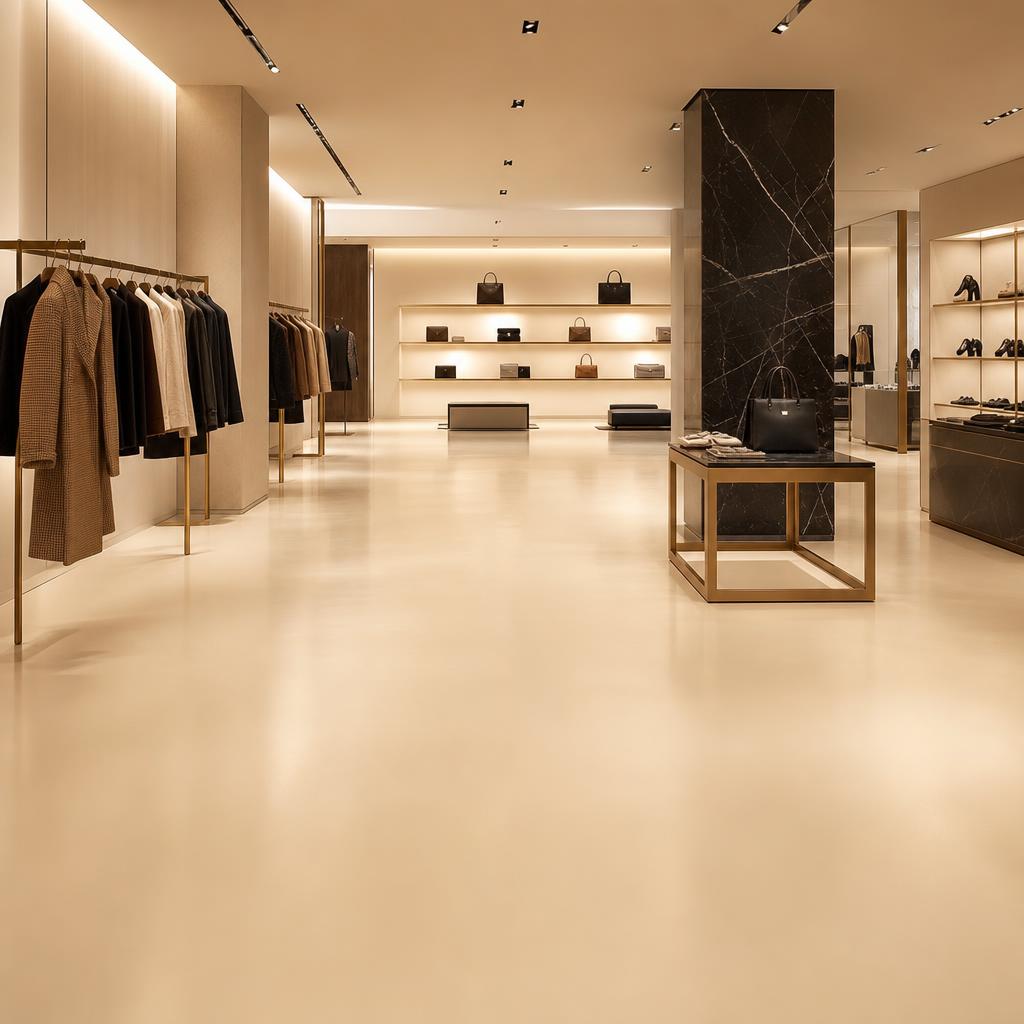
Commercial design
Brand-colour commercial epoxy: planning a retail or office floor
Translate a brand palette into a practical commercial floor using physical colour references, intended lighting and clear approval criteria for sheen and scale.
The short version
Approve a physical, finished colour sample in the actual design context. A screen value or printed logo is not a complete flooring specification.
Start with the role of colour in the space
Custom colour is a listed feature of Epoxy Australia’s commercial epoxy floors. For a retail store or office, first decide whether the floor should carry the main brand colour, support it with a neutral, or define a particular zone. These are different briefs even when they use the same brand guide.
A saturated colour across an entire floor can feel much stronger than the same colour in a logo. Consider merchandise, desks and wall graphics before committing to a large coloured field. The floor should remain useful when displays and furniture change, not only match the launch presentation.
Use a physical reference rather than a screen alone
Supply a recognised physical colour reference where available and ask how the proposed coating will be matched. RGB, HEX and CMYK values describe different media; none alone guarantees the appearance of a cured resin surface. Even a physical reference needs comparison with a sample of the actual finish.
Agree on who signs off the sample and under which lighting. Brand teams, designers and site managers should not approve different references independently. Keep one recorded approval so the installer is not left choosing between a printed brand manual and a later photograph sent by message.
Approve sheen and colour together
Satin and gloss can make the same colour read differently, particularly beside glazing or strong retail lighting. View the sample flat next to joinery, display materials and wall finishes. Check both the central area and the view towards windows, where reflected light may change the apparent tone.
Also consider what will be visible during operation. Very pale fields may reveal tracked-in dirt; very dark uniform fields can show light dust. This is not a reason to abandon brand colour, but it is a reason to involve the cleaning team and choose with the occupied space in mind.
- Identify the exact physical colour reference and sample approver.
- Confirm the intended satin or gloss finish.
- Review samples with the final lighting and adjacent materials.
- Record acceptable variation and retain the approved sample.
Resolve zone boundaries and future changes
If different colours define reception, circulation or merchandise zones, locate their boundaries on a dimensioned plan. Ask how the edges will be formed and how any necessary slab joints relate to them. Colour zoning should not be presented as safety marking unless the responsible project team has confirmed that use.
Discuss future repairs and refurbishments. A later colour batch or renewed topcoat may not blend invisibly with an aged surface. Keep the coating and colour records so future work starts from the installed specification. Brand consistency is easier to manage when the floor has an approval record rather than only a memorable colour name.
Want a clear answer for your space?