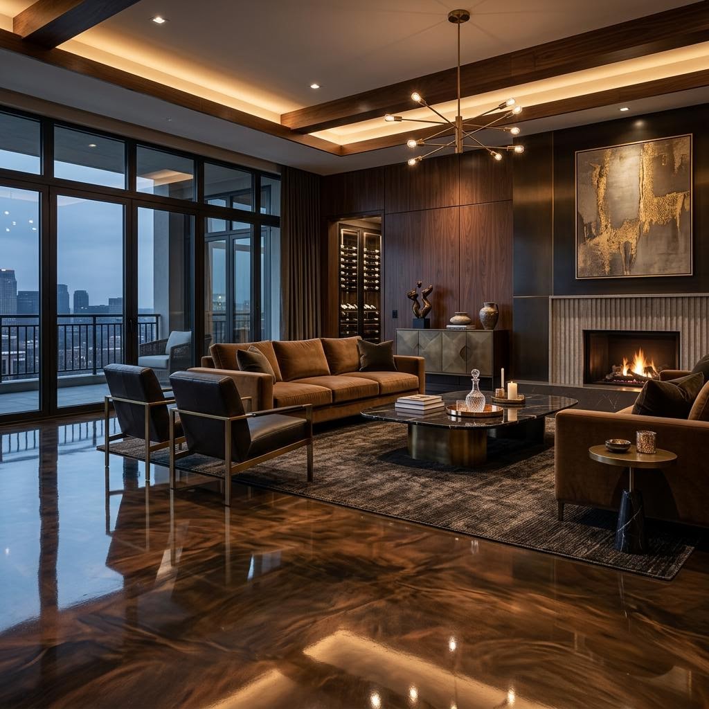
Metallic design
Metallic epoxy samples: what changes across a full-size floor?
Understand how hand-swirled movement, viewing distance and room proportions change the way a metallic epoxy sample translates to a finished floor.
The short version
Approve a direction for colour, contrast and movement, not an exact enlargement of a sample board. Map the main views before agreeing on the pour.
A sample is a material reference, not a miniature room
The hand-swirled pigments in our metallic epoxy flooring system create depth and fluid movement rather than a repeatable printed pattern. A small board can show the relationship between pigments and the clear finish, but it cannot predict the location of every swirl across a living room.
On a sample, a bright vein may occupy half the visible surface. Across a room, similar movement could read as an occasional accent within a much quieter field. Ask whether the sample represents the overall balance or deliberately shows the most expressive part of the finish.
Judge movement from the places you will actually stand
A floor viewed vertically in your hands is not the same as one viewed at a shallow angle from a doorway. Lay the board flat, stand back and look along it. Repeat the exercise from seated height where a sofa or reception chair will sit. Reflections can obscure some movement while revealing another layer of depth.
Use a simple plan to mark the entry, the longest uninterrupted view and the areas covered by rugs or furniture. A strong flow that looks effective in an open rectangle may feel fragmented around a kitchen island or a narrow corridor. Discuss the direction of movement in relation to the architecture rather than treating every square metre in isolation.
Separate colour approval from composition approval
Agree on the dominant tone first, then the amount and contrast of the accent pigment. Terms such as subtle, cloudy and dramatic mean different things to different people. Two reference images with notes about what you like are more useful than a folder of conflicting examples.
Ask which qualities the installer can aim to control and which remain part of a hand-applied finish. A reference photograph should not be treated as a promise to reproduce another floor. Record the accepted degree of variation before installation so the finished work is assessed against a shared brief.
- Identify the base colour and the lighter or darker accents.
- Describe whether movement should be broad, fine, sparse or concentrated.
- Mark dominant sightlines and any areas where visual calm matters.
- Keep an approved physical sample and dated notes about its purpose.
Use a larger mock-up when composition is critical
For a feature entry or large open interior, ask whether a larger mock-up is practical and what it would demonstrate. It can make the scale of movement easier to discuss, but it still does not eliminate the individuality of the final pour. Confirm any mock-up cost and limitations before relying on it.
Review the mock-up beside the actual adjoining finishes, with the intended topcoat, rather than judging pigment alone. The useful outcome is a clear design envelope: a dominant colour, an acceptable contrast range and a movement direction that suits the room. That gives the applicator meaningful guidance without asking a fluid material to behave like wallpaper.
Want a clear answer for your space?